
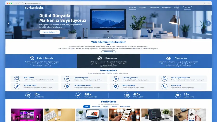
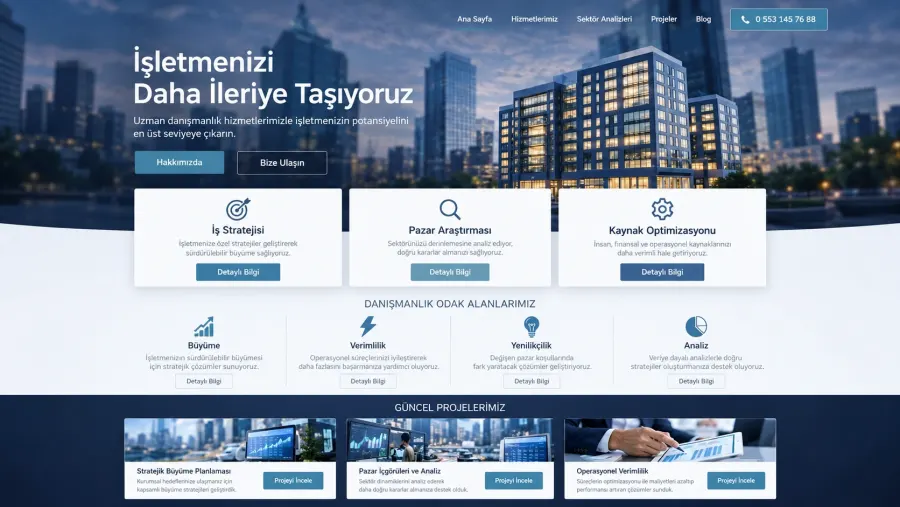





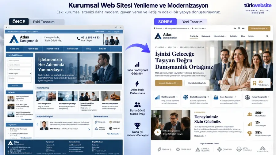

























Corporate Website Redesign and Modernization
Corporate Website Redesign and Modernization transforms your existing website into a more…
from $899
 Dental Clinic website
from $199
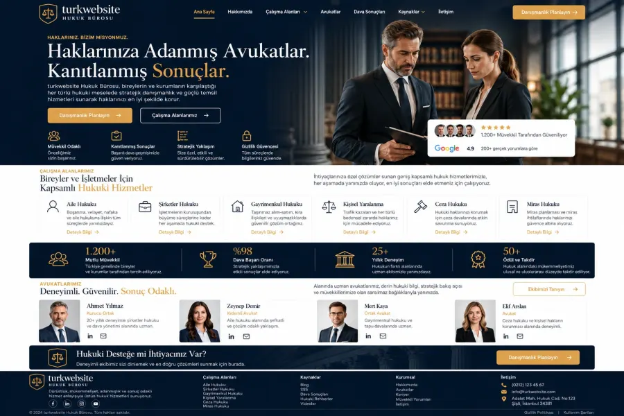 Law Firm website
from $249
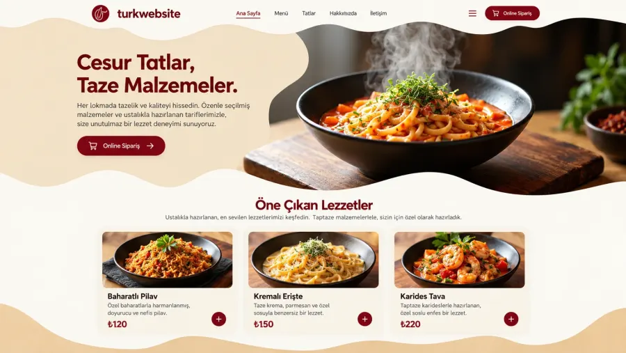
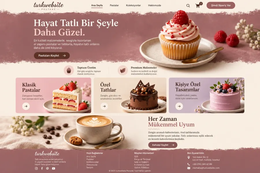 Café and Restaurant website
from $249
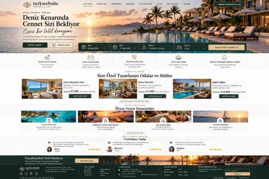 Real Estate Agency website
from $349
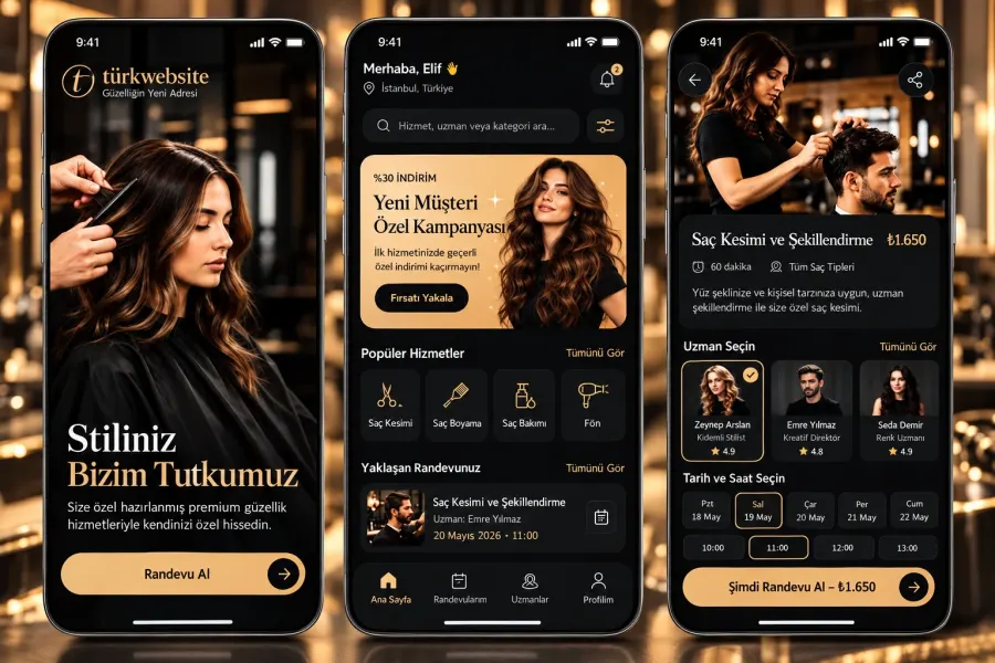
 Beauty Salon and Hairdresser website
from $229
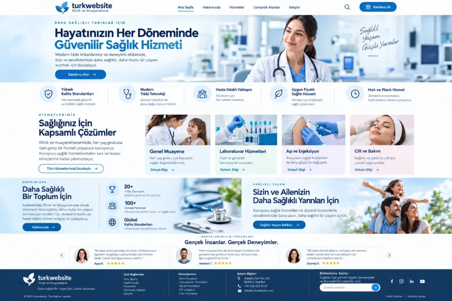 Clinic and Medical Practice website
from $249
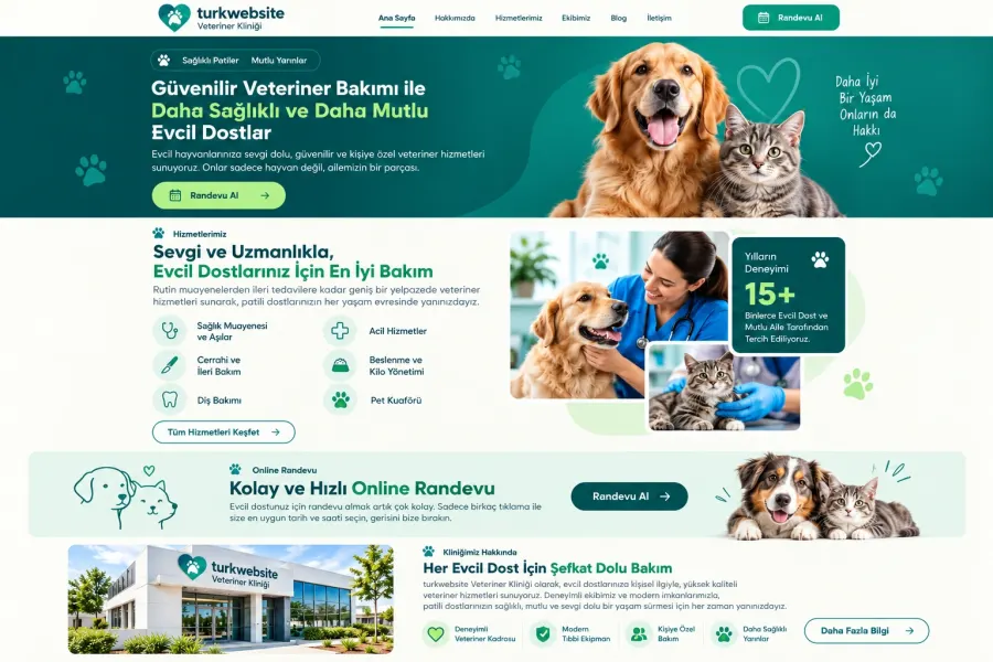 Veterinary Clinic website
from $249
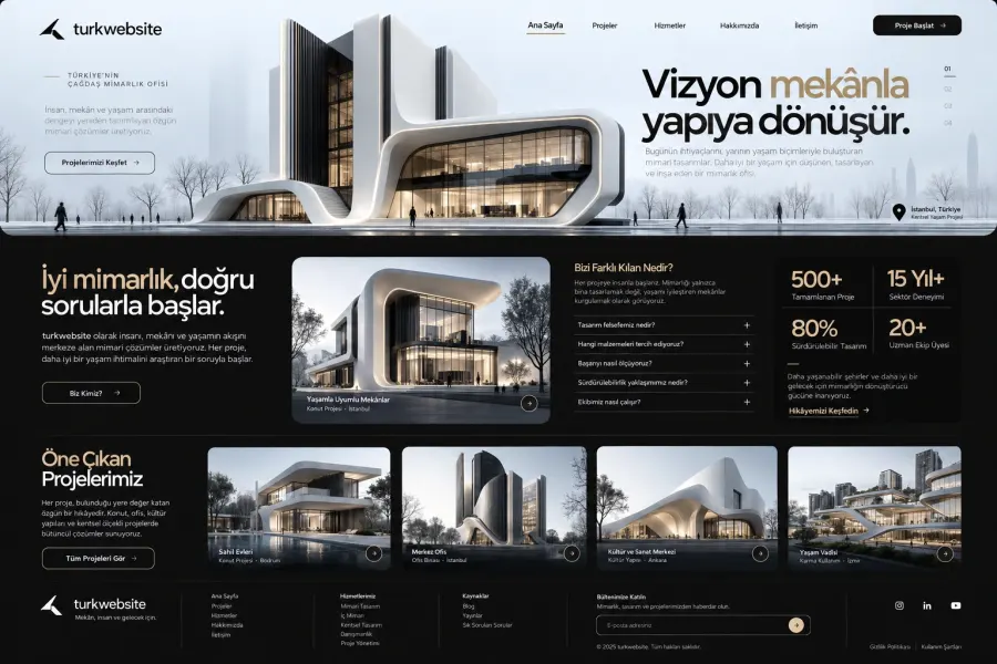 Architecture Office website
from $249
Website Redesign · Delivery: 3 business days
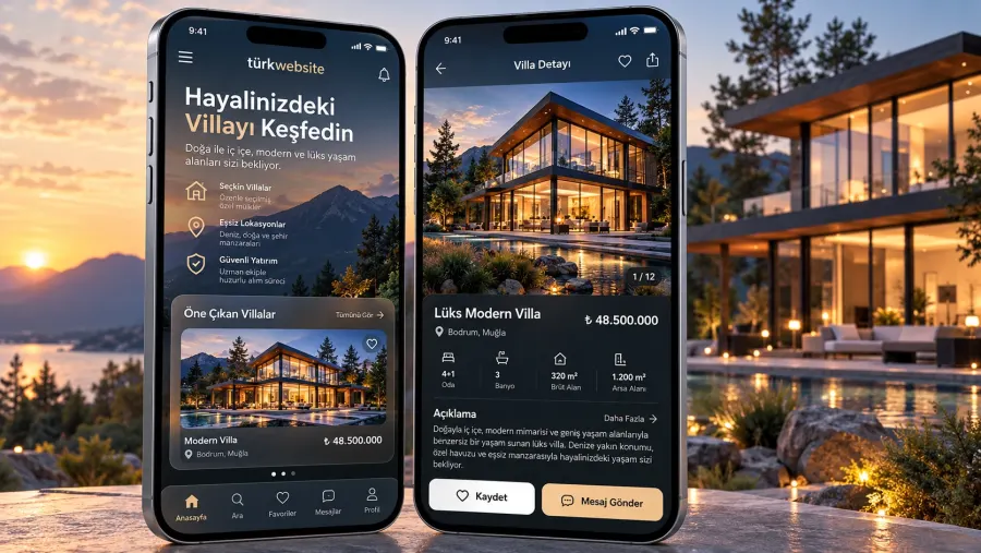
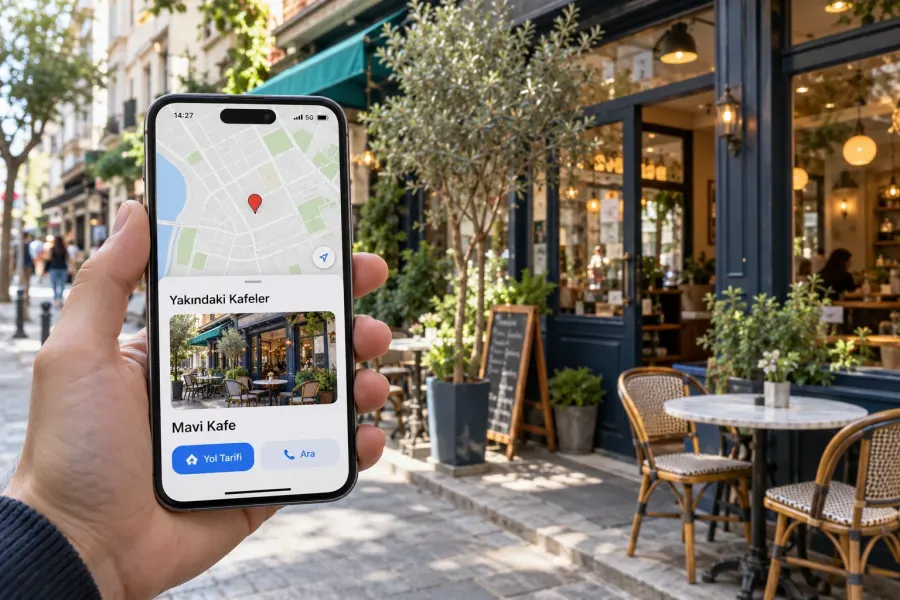
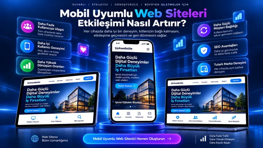
A mobile responsive fix is targeted work to make your existing site usable for visitors arriving on phones. Every page is reviewed at phone and tablet sizes; overflow, alignment and readability problems are resolved, menus and buttons are made tap-friendly and forms are verified to work on mobile.
A mobile responsive fix is targeted work that makes an existing site display and function correctly on phone and tablet screens. If your site looks fine on desktop but overflows on a phone, text is unreadable or buttons cannot be tapped, this is the service that solves it.
On most local service and retail sites the majority of visitors arrive on a phone. A site that looks fine on desktop but breaks on mobile sends that visitor straight to a competitor. The loss is silent: no call, no form.
Forms are the most commonly overlooked part on mobile. Fields that disappear when the keyboard opens, the wrong keyboard type and an invisible submit button all translate directly into lost enquiries. After the fix, forms are tested at real device sizes.
Search engines evaluate a site primarily through its mobile view. A site that cannot be used on mobile is at a disadvantage in rankings even when its content is strong. At the end of the work the Google mobile usability test result is shared as a report.
Standard scope is completed in 3 business days. Pricing depends on page count, platform and how widespread the problems are. If the whole site is to be redesigned, the redesign services are a better fit.
Let us review your site on a phone and map out what needs fixing.

Corporate Website Redesign and Modernization transforms your existing website into a more…
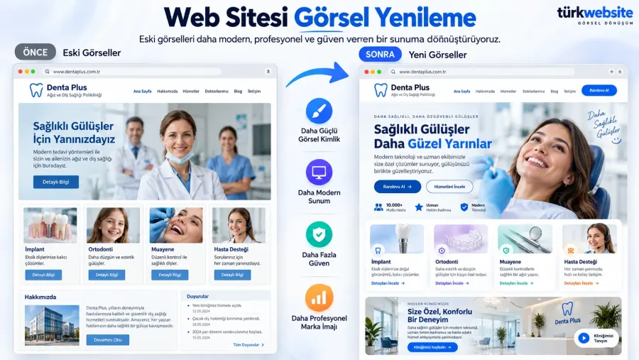
Website Design and Visual Refresh transforms your existing website into a more modern…
Website speed and user experience improvement measures your page load time and Core Web…
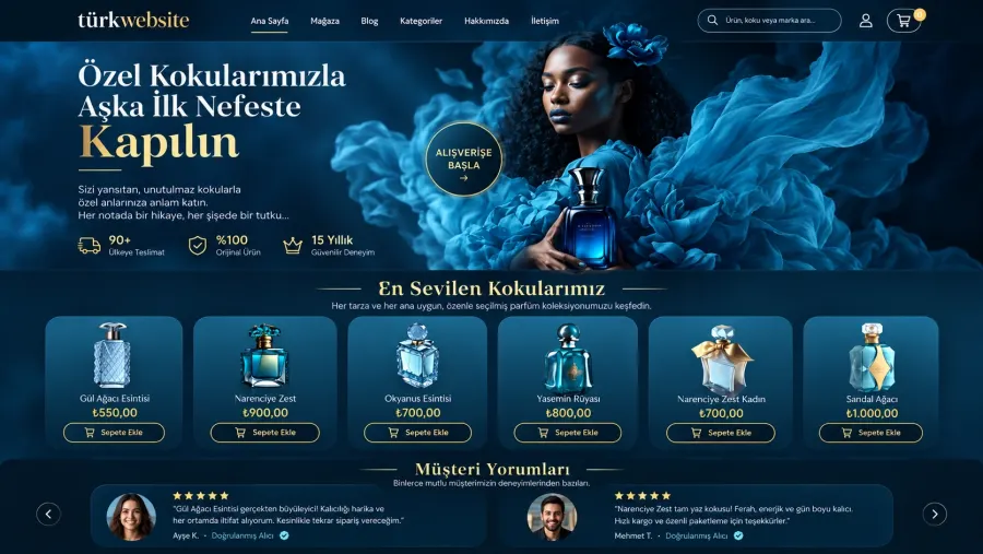
E-commerce website redesign is a full refresh for stores that still sell but look and…
The first call is free. If you have a domain or an existing site, send us the link; we reply within 1 business day.